Deliverable · Logo animation
Logo animation & motion identity
The short answer
A logo animation is the mark arriving; a motion identity is the rule that keeps everything after it agreeing. This studio builds both as code, rendered deterministically, so the same build returns the same frames — a thing a generative model cannot promise. 3 identity pieces here, 0 of them made for a real client, and no frame is AI-generated.
Blue Snow Developers builds a mark that arrives instead of appearing: drawn on screen rather than faded up, and built as code rather than keyframed by hand — so the animation, the mark and the brand book all read the same colour and type values instead of copying them from each other.
A logo animation is the mark’s behaviour, not an effect applied to it
Most animated logos are a static mark with motion added afterwards — it slides, it bevels, it settles under a lens flare. Nothing about the movement comes from the mark, which is why one animated logo can be swapped for another without anybody noticing. The alternative is to animate what the mark is made of: if it is drawn, draw it; if it is built from parts, assemble it; if its whole idea is growth, let it grow. Then the motion is an argument about the brand rather than a treatment applied to it.
That distinction is also the difference between the two things this page sells. A logo animation is one asset, a couple of seconds long, for a title card, an app splash, a social sting or a trade-show loop. A motion identity is the set of rules underneath — pace, easing, how the mark enters, what the rest of the brand does when it moves — and it is what stops the next twenty pieces of film disagreeing with each other. What the studio makes and how a project runs covers where identity work sits against a brand film or a data-driven video or a promo built for the feed or ad creative fanned out across a hundred markets.
3 identity pieces — all self-initiated concept work
Everything on this page is self-initiated studio work for brands that do not exist. None of it was made for a client, none of it was briefed by one, and each piece carries (Concept) in its title — including the accessible name a screen reader reads out, which is the surface an honesty label usually goes missing from. The studio's one real film client is a mortgage lender, and what that lender received was film work: a brand promo and a market-update format, neither of them an identity. Those live with the brand films and the data-driven video work, not here.
Concept work is worth showing on its own terms — it is where a studio proves range before a client is willing to fund it — but it proves craft, not demand, and the two are not interchangeable. What it cannot show you is a mark surviving contact with the people who have to live with it, and that is a real difference rather than a technicality. Everything below is also in every piece in the library, filtered by what it is and who it was for, carrying the same honesty label they carry here.
Drawn from one line — and drawn identically every single run
The film above builds its mark rather than presenting it. A stroke climbs and curves, throws fine filaments off either side, and resolves into a botanical form with one lit node at its base; particles scatter and settle into that node; the wordmark arrives only once the drawing has finished, and the piece closes on a brand sheet where every colour chip is captioned with its own value. The craft note on that piece goes through it frame by frame, including what is wrong with it.
The part worth caring about is not visible on screen. Those filaments are not drawn by hand and they are not random: they are derived from a fixed seed, so the build produces the identical flourish on every run, on any machine, in a year. Change the seed and you get a different mark; keep it and you get the same one forever. Which matters, because a logo is the one asset a brand has to reproduce exactly — on a sign, in an app icon, in a footer, in five years — and reproducing it exactly is the thing a studio is actually being paid for.
None of these three looks like the others, and that is deliberate. The engineering is reused and the appearance never is, because a studio whose identities all share a house style is selling you its own taste with your name on it. The same discipline runs through work as far apart as a milled-titanium fintech film (Concept) and a gold-seam ceramics film (Concept).
The mark, the film and the book come out of one token source
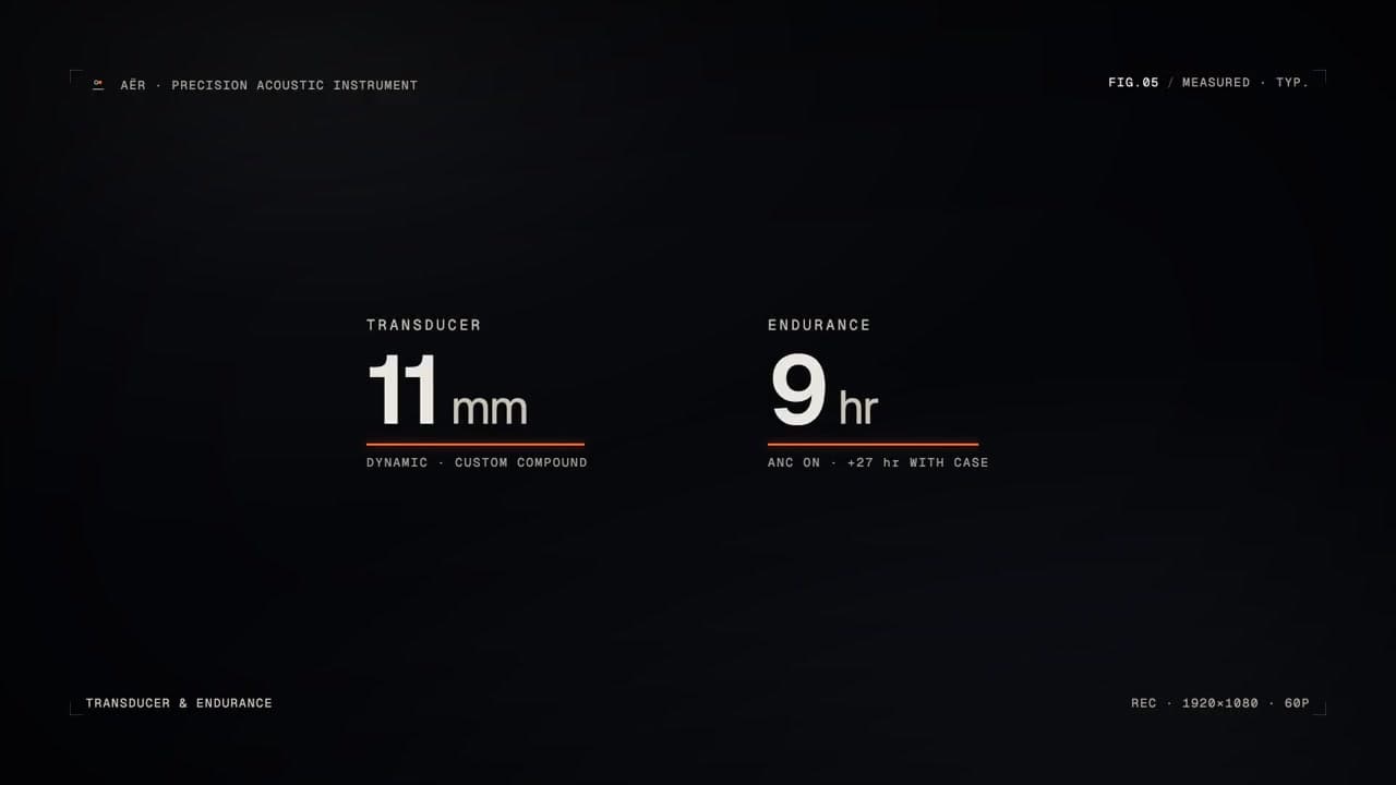
The common failure in brand work is that the launch film and the identity system get made by different hands from the same PDF, and drift apart before anyone notices. That costs a rebrand rather than a revision. Building them from one set of tokens removes the possibility instead of managing it: change the accent and it moves in the film, the mark and the document at once, because all three are rendered from the same values rather than each holding its own copy. AËR (Concept) is the whole set arriving together off one brief, and the brand book is published underneath the film rather than described in it — so the claim can be read instead of taken on trust.
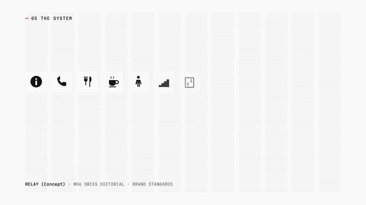
The second piece exists specifically to make that claim falsifiable. RELAY (Concept) is an identity system shot as a numbered document — the grid, the type, the colour, the mark, its application, the tokens — and its colour chapter sets the token value in mono across the swatch it is describing, overprinting it rather than sitting safely beside it. Sample that swatch in the delivered file: the reading comes back within a unit per channel of the value printed across it. Which is the point of publishing a standards document at all — so you can check it. The studio runs its own identity system the same way, tokens included, so you can read the deliverable before commissioning one.
What ships — and where our own library does not meet it
Every ratio the brand actually posts in is built as its own composition rather than trimmed down from the wide one. Where the engagement covers the system too, the mark, palette, type scale and motion rules render from the same values as the film, and every source file is yours once it is paid for. AËR’s vertical cut (Concept) is a genuine phone-first build and RELAY’s square (Concept) re-composes with its type reflowing.
The piece at the top of this page shows the same rule. SÈVE’s delivered vertical (Concept) is built in three shapes from one source, and its square re-composes the closing brand sheet for its own frame rather than cropping the wide one: wordmark, logo plate, type specimens and every colour chip sit inside it.
A mark has to survive being redrawn at every size, on every ground, for as long as the brand lasts — so nothing here is drawn by a generative model: not the mark, not the type, not the transitions. One element is synthetic, and naming it is cheaper than having you find it. Where a film on this site speaks, the script is read by a text-to-speech engine rather than performed in a booth. No voice is imitated, sound is opt-in on an identity build, and the engineer who writes the code and cuts the frames is the reason any of this is checkable rather than a promise.
How a logo animation project runs
You send the mark if you have one, and what it has to live inside — the colours, the type, where it appears first. If there is no mark yet, that is the first thing built, and the animation is designed as part of it rather than bolted on afterwards, which is the whole reason the two arrive agreeing with each other. A revision is a re-render rather than a rebuild, and there is no account manager in between: the person reading your brief is the person drawing the mark. Tell us what you are making and it reaches the founder, not a queue.
What you keep afterwards is worth being plain about, because "built as code" can sound like a lock-in and it is meant to be the opposite: once it is paid for you own the source, and the deliverable includes rendered masters in the ratios you need, so the animation stays usable by anyone you hire next whether or not they can read the build. The field notes are where the engineering behind this gets written down. Where the subject is money rather than identity, the finance and fintech work is collected on its own page.
How long should a logo animation be?
Two different pieces answer to that name and they are not the same length. A motion ident is the signature that tops a film, opens an app or loops on a screen at a trade show — it is cut to the slot it has to sit in, which is why the same mark can need more than one length rather than a single correct one. A logo film is the other thing: the piece where the mark itself is the subject, with somewhere to go — a draw, a settle, a resolve — and it runs long enough for that to happen.
The piece at the top of this page is the second kind. SÈVE (Concept) runs 31 seconds, read off the encoded file this site serves rather than quoted from a brief, and all 3 delivered ratios are that same length, because they come out of one build instead of being re-timed by hand. If you already know the slot — the head of every social cut, the pre-roll before a keynote, the loop on a stand — say so in the brief and the piece gets designed to it, which is not the same job as trimming something afterwards.
What to ask before you commission identity work
Have you animated a logo for a real client?
Not yet. Every identity piece here is self-initiated studio work for a brand that does not exist, and each one is labelled "(Concept)" everywhere it appears. The studio’s one real film client is a mortgage lender, and the work delivered for them was film work — a brand promo and a market-update format — rather than an identity. Concept work proves craft and method; it is not a client list.
What is a logo animation, and what is a motion identity?
A logo animation is one asset: the mark arriving, usually in a couple of seconds, for an opening title, an app splash, a social sting or a trade-show loop. A motion identity is the rule behind it — how the mark behaves, at what pace, with what easing, and what the rest of the brand does when it moves. The animation is the part you can watch; the identity is the part that keeps the next twenty pieces of film agreeing with it. Studios that sell only the first tend to hand over a file; the second is what stops a brand looking like a different company in every video it makes.
Do we need a finished logo already, or can you design the mark too?
Either. Where a mark already exists, the animation is built around it and the identity rules are written to fit what you have. Where it does not, the mark and the system come out of the same build as the film: AËR (Concept) delivers a launch film, a mark, a colour system and a type scale from a single brief, and RELAY (Concept) is a numbered identity system with the mark as one of its chapters. SÈVE (Concept) is the third case — the mark is drawn on screen as the animation, so the reveal and the design are one artefact rather than two.
Is any of it AI-generated?
Nothing you SEE is. No generative image or video model draws a frame of this work — no AI footage, no AI frames, no generated imagery of any kind. That matters more here than almost anywhere else on the site, because a logo is the one asset a brand has to reproduce exactly, forever, and a generative model cannot give you the same output twice. SÈVE’s filigree is drawn from a fixed seed for that reason: keep the seed and the mark is identical on every run. One thing IS synthetic and we would rather name it than have you find it — the narration on the films that have a voice, including the one at the top of this page, is rendered by a text-to-speech model rather than spoken by a person. No voice is cloned from anyone. A logo animation ships without narration unless you ask for it.
Will the animation match our brand book, or drift away from it?
It comes out of the same source, which is the point of building identity work this way. The colours, the type scale, the spacing and the motion easing are read from one set of tokens, and the film, the mark and the document are all rendered from those tokens rather than each being made by a different hand from the same PDF. RELAY (Concept) exists specifically to make that checkable: its colour chapter prints the token value across the swatch it is describing, so the document can be tested against itself in a single frame. Sample the delivered file and it comes back within a unit per channel of the number printed on it.
What ratios does a logo animation ship in?
The ones you actually use — a wide cut for titles and the site, a vertical for social and an app splash, a square where a feed wants one — each composed at its own ratio from the same build rather than re-edited afterwards. AËR’s vertical cut (Concept) is a genuine phone-first build, RELAY’s square (Concept) re-composes with its type reflowing, and SÈVE’s square (Concept) rebuilds its closing brand sheet for the frame rather than cropping the wide one.
What is actually in a brand kit, and do we get the source files?
A document and the values behind it, not a mood board. RELAY (Concept) is built as a numbered one and its chapters are the manifest: the grid, the type, the colour, the mark, the system, its application, the tokens, the key art, and the bound book itself. The tokens chapter is the part that does the work — corner radius, baseline grid, type scale, motion easing and the surface ramp, published as values rather than described in adjectives, which is what makes every other chapter checkable. AËR (Concept) publishes its book underneath the film on its own page rather than promising one, with each colour named against the rule for where it may be used. Identity is scoped as its own line, with or without a film, and the source files are yours once the engagement is paid in full; that is the whole point of delivering a system instead of a set of exports.
How is a logo animation built in code different from one made in After Effects?
Mostly in what happens after delivery. A timeline file is a rendering of one set of decisions; a coded piece is the decisions themselves, so a colour change, a new wordmark or a fourth ratio is a re-render rather than a re-build, and the same input always produces the same frames. It also means the animation can be driven by the same tokens as your website and your brand document instead of having those values typed into a timeline by hand. The trade is that code does not replace filmed footage: where a project needs it, that footage comes from you or a videographer, and the coded layer is built around it.
See your own mark in this studio’s hands
Three concept identities show the method. Your own mark is the harder test, because it already exists and it has to survive the treatment. Hand over the logo you use today and the address it lives at, and if there is capacity that week, one gets animated as a watermarked study. It costs nothing and commits you to nothing.
Written by Baljeet Aulakh, who builds every piece in this portfolio. Last updated . No AI-generated frames.