Data visualization video. Numbers that move.
The short answer
Data-driven video turns figures you supply into animated charts, maps and market reads — built as real components rendered from code, never filmed and never generated. This studio publishes 6 data films, 1 of them made for a real client. Every figure in the charts names the dataset it was read from.
Data-driven video, built by hand from your real figures — animated charts, maps and market reads, clean enough for a brand or legal review. Never AI-generated. You supply and approve every number.
The market-update format, built for a real lender
Pulse Mortgage — a real client — needed a market read for the feed, and we built them a vertical 9:16 one. Every figure in it is a dated public primary source — Freddie Mac’s weekly PMMS survey and US Treasury yield data — and the motion is built exactly to the data. It is built once as a format, so the next read is a re-render against new figures rather than a new build — and it is the clearest proof the data-video specialty isn’t a demo.
What this looks like for banks, lenders and fintech brands collects the finance work in one place — including the two pieces built for Pulse — and says which of it was made for a real client.
See the Pulse market updateBuilt, not generated
We build motion from your real numbers, by hand. AI video invents pixels. When the figures matter, that difference is everything.
Built by hand
Our Approach- Your real figures, unchanged
- Built by hand — every frame reproducible
- Never AI-generated, zero hallucination
- Clean enough for brand or legal review
- You supply and approve every number
- Source files delivered to you
Generative
AI Video- AI-generated imagery
- Different every run
- Can invent details never in the data
- No source, no audit trail
- Entertainment-grade, not report-grade
Built from your numbers
Every element is a real component we design and render by hand — your figures in, a frame-accurate data-story out. Nothing generated, nothing invented.
Line & trend charts
Rates, revenue, growth — drawn on as the story lands.
Bar & comparison charts
Figures set side by side, built and settled so the read is instant.
Number & rate tickers
Live figures counting into place — the moment a number moves, felt.
KPI & metric reveals
Headline numbers revealed one beat at a time, each with room to breathe.
Animated maps
Locations, routes and reach — markers and arcs drawn onto a clean map.
Data tables in motion
Rows that build on screen, so a dense table becomes a sequence, not a wall.
Index & score gauges
A single score swept onto a dial — the fastest way to read good or bad.
Lower-thirds & callouts
Names, sources and footnotes, set in the same type system as the brand.
Market-update format
The recurring vertical read — your numbers re-rendered, feed-ready.
Source & footnote layer
Every figure attributed and dated — clean enough for a brand or legal review.
Title & brand framing
Open and close in the brand's own type, colour and motion signature.
Multi-format masters
Composed once, so the ratios an engagement needs come out of the same build.
The process
Your data goes in. A hand-built data-story comes out. Five stages, founder-direct, and you approve every figure along the way.
Your data & brief
Figures, brand, the story
- Your figures & sources
- Brand colours, type, logo
- The story you want told
Design the read
How each number moves
- Storyboard the data beats
- Design the motion system
- Lock the look with you
Build by hand
Engineered motion, not AI
- Charts & maps as real code
- Frame-accurate, reproducible
- Never AI-generated
Sound & polish
Voiceover & sound design
- Scored to the data beats
- Timing cut to the numbers
- Final grade & QA
Delivered your way
Every format, source included
- The ratios the run needs
- Source files yours once paid
- Re-renders against new figures
Data visualization in the frame
D3 charts, animated maps, index gauges, side-by-side comparisons — rendered as real components inside the film and driven entirely by your figures.
The four panels below are drawn illustrations of chart types. The figures in them are placeholders and belong to no one — the real work is the six films further down, where the datasets behind the figures are credited in the frame.
Median Sale Price — 12 Month Trend
Your Figure vs Market
Index Score
Neighborhood Map
Your data, your source files
Every figure is one you supply and approve — attributed and dated, clean enough to put in front of a brand or legal review. Nothing is invented, and the source files are delivered to you.
The data films this page is describing
Everything above is a description of a pipeline. Below are the 6 finished pieces that came out of it — open any one and its page shows the brief, the technique and the related work beside it. One of them was made for Pulse Mortgage, our real film client — see also their multi-format brand promo. The rest are self-initiated studio pieces and every one of them says so in its title.
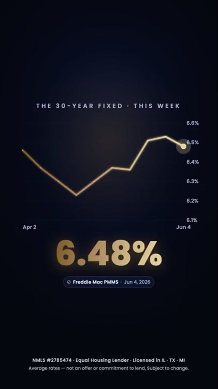
Pulse — Market Update
Real-client 9:16 market-update data story (dated weekly rate and market figures)
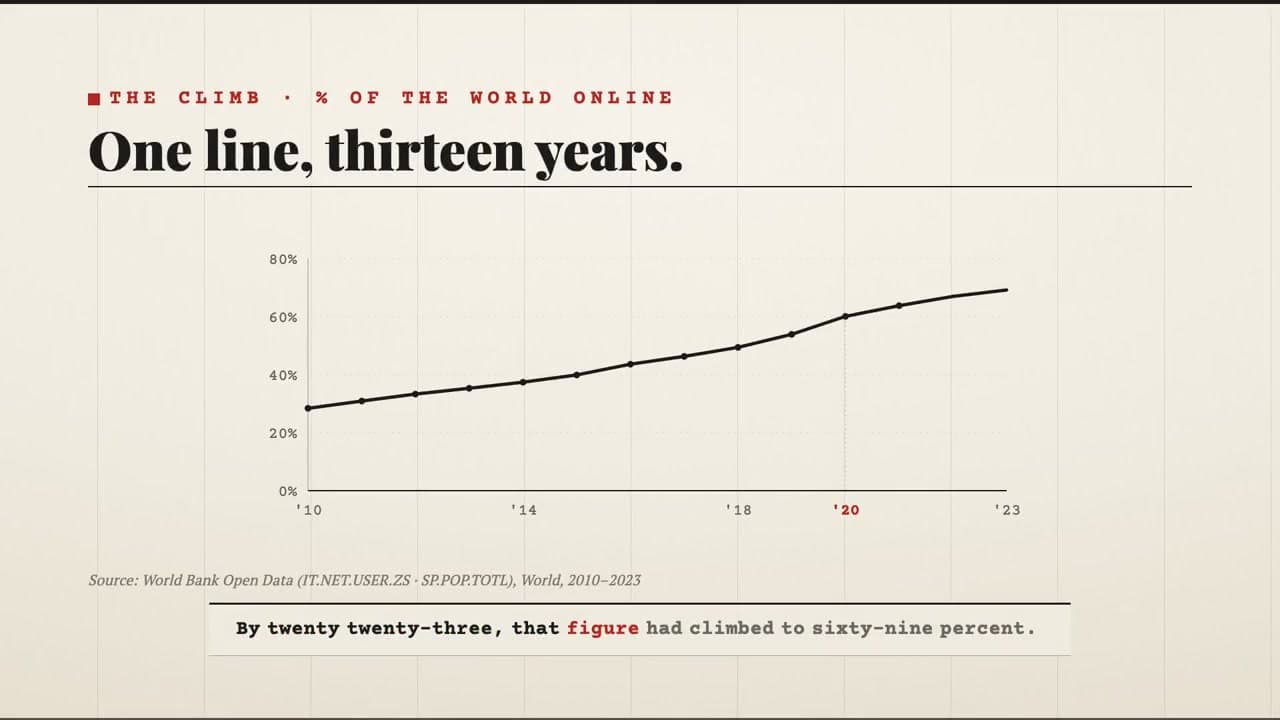
The Dispatch (Concept)
Narrated editorial data-story — a decade in numbers, spoken end to end
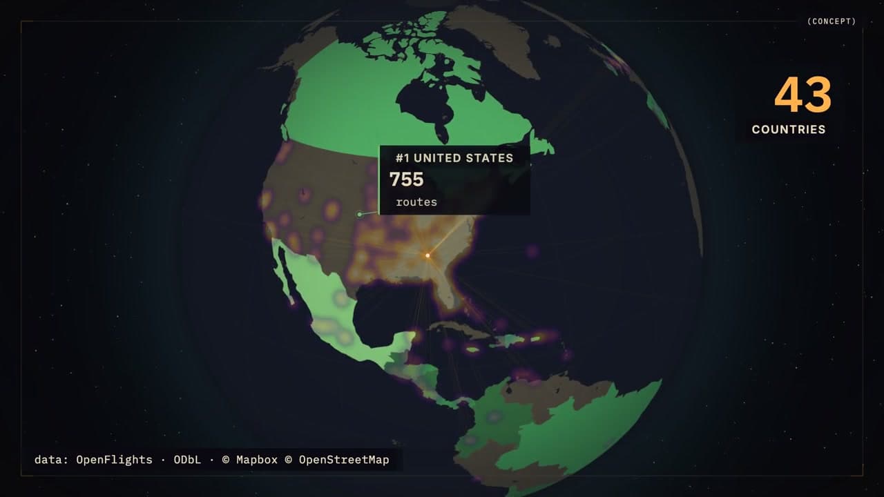
The World Stays Up Late (Concept)
Geospatial narrated network story, told inside a live map, spoken throughout
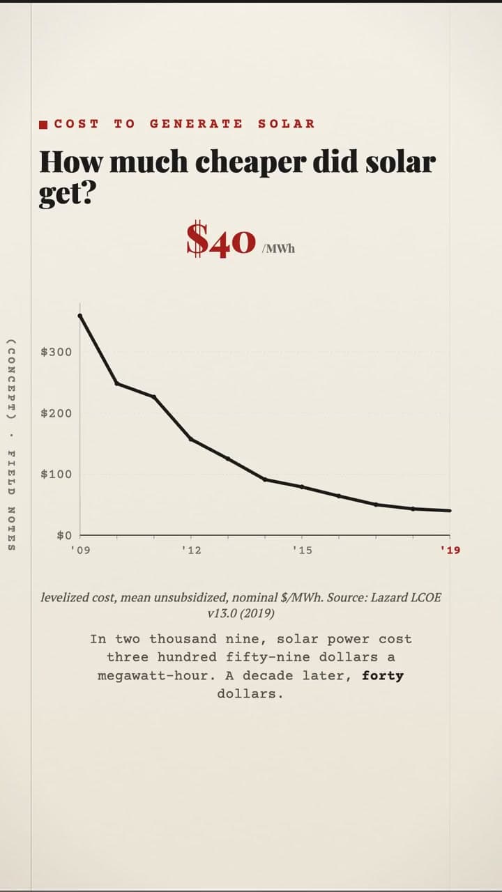
Field Notes (Concept)
9:16 vertical cited micro-fact drop — data journalism, one true number a day
Index Card (Concept)
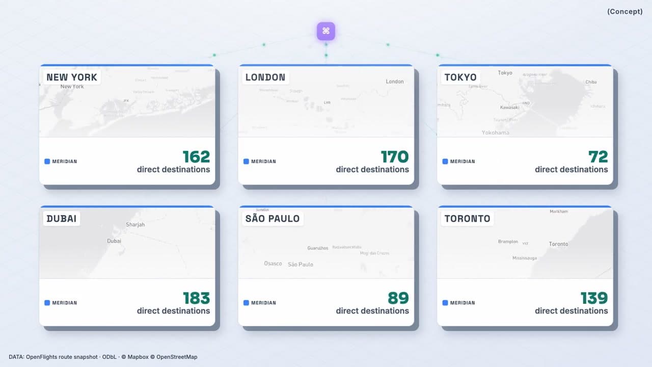
One composition rendered for every city, the brand layer locked
Strata (Concept)
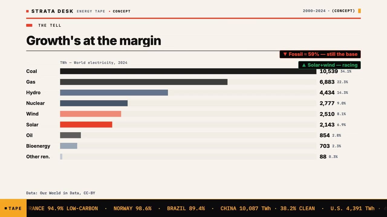
Multi-chart report-film, narrated — beat-synced D3 charts
Data-driven video is one of the things the studio makes, alongside websites, apps and brand films. The full range, and how a project runs covers identity systems and builds alongside it. There is a separate page for the 13 brand films, and which one was made for a real client. The whole library of brand films and motion work is the wall these six came off. The studio’s own identity system shows the tokens and motion rules that keep a chart looking like your brand rather than like a spreadsheet.
On why none of this is generated: we built an AI video generator and still cut every film by hand is the long answer, and the rest of the field notes are where the engineering gets written down. The engineer behind it is one person, which is why telling us about your project reaches him and not an account team.
What a number needs on screen before anyone can check it
A data film is worth what a sceptical viewer can do with it. Every other kind of film asks to be believed; this one has to hand you the means to disagree. That is a production decision, and it is made in the four or five lines of small type most studios treat as a footnote.
In the narrated editorial film the italic line under the chart carries the World Bank indicator codes themselves, along with the territory and the year range. That is more than a credit — it is a retrieval key. A viewer who doubts the shape of that line can fetch the same two series and draw it again without asking us for anything.
It costs a few characters of small type and almost nobody will ever use it. That is not an argument against it. The people who do check are the ones deciding whether the film can be published — a compliance reviewer, an analyst, a journalist — and they are checking whether you expected to be checked.
Sometimes the meaning turns on four words. The vertical micro-fact film exists to deliver one figure — a cost per megawatt-hour — and a cost per megawatt-houris meaningless until you know which cost. So the line beneath it carries the study’s version number, its year, and the four qualifiers that fix the reading: levelized, mean, unsubsidized, nominal. Flip any one of them and the answer changes. They are on screen rather than in a footnote nobody opens, which is also the cheapest insurance a brand can buy against being quoted back at itself.
And a figure can be true and still mislead by omission. The multi-chart report film ranks the world’s electricity sources in one horizontal read, and every bar carries both its absolute figure in terawatt-hours and its share of the total. A bar you cannot read a number off is decoration; a share without an absolute hides the size of what is being shared. Those are the two most common ways a chart flatters whoever commissioned it.
Attribution that survives the crop
Open datasets and basemaps come with licence conditions, and the usual way to satisfy them is an end card. An end card is also the first thing trimmed when a film is cut for social — so the credit is present in the master and absent in every version anyone actually sees. The test worth applying is whether the attribution survives the crop.
On the geospatial film three separate credits — the route dataset under its share-alike terms, the basemap, and the map data underneath it — are burned into the plate for the full runtime. It is the part of the work nobody photographs and the part a corporate legal review opens with. It is cheap at build time and expensive to retrofit, and it is the reason a film like that can go in front of a compliance team at all.
The same logic governs the honesty label. On the report film the word CONCEPT is set into the running head and repeated beside the year range, in the pixels rather than on this web page — because a label is only worth something if it survives the clip leaving the site. Screenshot that frame, re-post it anywhere, and it is still marked as a concept study.
One place it does not hold, stated because a page arguing this cannot only publish its wins: the city-by-city film carries its credit line beneath the full six-card composition rather than inside each card. Crop a single plate out, share it alone, and the attribution does not travel with it. On a piece whose whole purpose is fanning out to many markets that is a real limitation rather than a detail, and the honest fix is per-plate attribution in the composition — not a note on a web page. The variant system that film is built on is set out on the ad-creative page, and the case for building one film per market rather than one film is the argument the Cleveland page makes to a business running several addresses in one metro.
Choosing the axis is choosing the story
There is no neutral chart. Every scale is an argument about what counts as a big change, and the honest move is to make the choice deliberately and then say what you chose.
The chart in the market-update film built for a lender holds one series and nothing else — no second line to compare against, no gridwork competing with the data. Its vertical axis is banded to the range the rate actually occupies rather than dropped to zero, because at a zero-based scale a week of movement in a mortgage rate renders as a flat line, which is the opposite of the truth. Both ends of the window are dated on the axis so the period is explicit, and the week’s figure is set larger than anything else in frame, because on a phone at arm’s length it is the only element that has to survive.
Beneath that figure sits a chip naming the published series it was read from and the date that series was released. Dating the release matters more here than anywhere else on this site: a rate is only true of a moment, and a market-update video with no date on it starts quietly misinforming people the week after it ships.
A film that only shows and never states leaves the viewer to guess what they were meant to see, and viewers guess generously. So the report film puts two callout pills on the plate carrying the actual reading of the chart — that fossil generation is still the base, and that solar and wind are the ones moving — while a second layer runs country figures along the bottom as a tape. The headline plate carries the structure; the ticker carries the texture underneath it.
Where a figure is regulated, the disclosure has to travel with it rather than wait for an end card. How a required disclosure is built into a promo sets out where that layer sits, what the lender film carries from its first frame, and the one measured window in it that carries none.
The words are published too, where the film carries them
Of the 6 data films here, 4 ship a caption track, and the narration on those is published verbatim on the piece page — not summarised, not rewritten for the web. It is generated from the caption file the player itself loads, so the words on the page and the words in the film cannot drift apart. Where a voice is synthetic, the film’s own page says so rather than leaving it for you to notice — the same disclosure the explainer work has to make, where the voice carries the whole film.
The same principle runs under the specs. Every piece page prints a measured line under the film — the real duration and the ratio it was delivered in, read off the delivered file rather than typed from a brief. The point of publishing all of it is not thoroughness for its own sake: it is that a claim you can check is worth more than a claim you have to accept, and this is the one part of a studio’s work a buyer can verify before any money changes hands.
How long each data film runs, and what it was delivered in
Everything above argues for a way of working. This is the shelf it produced — the sectors each piece was built for, the ratio it ships at, and a runtime taken from the video this page will hand your browser rather than quoted from a brief. 1 of the 6 was made for a real client and the rest are self-initiated, which every title says for itself.
Swipe the table for runtime and origin
| Film | Sector | Delivered at | Runtime | Origin |
|---|---|---|---|---|
| Pulse — Market Update | Finance · Real estate | 9:16 | 29 sec | Real client |
| The Dispatch (Concept) | SaaS & tech · Finance | 16:9 | 24 sec | Studio concept |
| The World Stays Up Late (Concept) | SaaS & tech · Real estate | 16:9 | 50 sec | Studio concept |
| Field Notes (Concept) | SaaS & tech | 9:16 | 20 sec | Studio concept |
| Index Card (Concept) | Real estate · Local & service | 16:9 | 42 sec | Studio concept |
| Strata (Concept) | Finance · SaaS & tech | 16:9 | 53 sec | Studio concept |
Questions buyers ask about data-driven video production
What is a data-driven video?
A data-driven video is a film whose content is your figures rather than footage: charts, maps, tickers and tables built as real components and animated from the numbers you supply. A chart is drawn from the dataset, so if the dataset changes the chart changes with it. It is also called a data visualization video or a data storytelling piece, and it is the corner of video production where the content is the dataset rather than the camera. The format suits an annual report, a market read, an investor update or a state-of-the-industry film — anywhere a number has to land and also has to be right.
Where do the numbers in a data-driven video come from?
You supply the numbers and you approve them, and no figure reaches the screen that did not come from you or from a published dataset credited in the frame itself rather than in a description underneath it. Crediting the source inside the picture is what lets the claim travel with the film. One exception is on this page: the four chart panels above are drawn illustrations of chart types, not client data, and they are labelled illustrative for that reason. The films are the opposite — the figures in their charts are read from real published datasets.
Can the figures in a data video be independently checked?
A figure in a data video can be checked by pulling the same published series the film used, which is why a source line should name the series rather than the institution. Naming an institution gestures at rigour; naming the series is rigour, and it is the cheapest thing a data film can do to earn trust. In the narrated editorial film on this page, the line under the chart carries the World Bank indicator codes themselves along with the territory and the year range, so a reader can retrieve the same two series and redraw the line for themselves.
Are data visualization videos AI-generated?
Nothing you see is — and one thing you hear is. No generative image or video model draws a frame of any Blue Snow Developers data film: every chart, map, gauge and tape is a real component drawn from the dataset, so nothing can appear on screen that was not put there on purpose. A generative model asked for a chart will invent a plausible-looking trend, and a plausible-looking trend is precisely the failure a data film exists to avoid. The synthetic element is the voice: where a film speaks, the narration is a text-to-speech render rather than a person at a microphone, and it imitates no one.
Will a data video clear compliance and legal review?
A data video clears compliance when its attribution and disclosure layers survive the crop, which is the test worth applying. Credits burned into the plate for a full runtime travel with the film; credits parked on an end card do not, because an end card is the first thing trimmed when a film is cut for social. On the geospatial film three separate credits — the route dataset, the basemap and its underlying map data — are burned in for the full runtime. On the market-update film built for a real lender, the foot of the frame carries the registration number, the Equal Housing Lender wording, the licensed states, and a line stating that these are average rates and not an offer or commitment to lend. The closing card then carries a different form rather than a longer one: it keeps the registration and the state list, drops the average-rates line, and adds that all loans are subject to credit approval. Because both are part of the composition, correcting a line is a re-render rather than a reshoot.
What labels and disclaimers does an on-screen figure need?
A figure needs the words that fix its meaning sitting beside it on screen — the version of the study, the year it covers, and the terms that decide what it measures — because flipping any one of them changes the answer without changing the number. On the vertical film built around the fall in the cost of a megawatt-hour, the plate carries the study’s version number, its year, and the four qualifiers that fix the meaning: levelized, mean, unsubsidized, nominal. On the report film every bar carries both its absolute figure and its share of the total, since a share without an absolute hides the size of what is being shared.
Can a data video be updated when the figures change?
Yes. A data video built as a format can be re-rendered against new numbers instead of rebuilt from scratch: the composition, the motion and the compliance layer stay in place, and only the data underneath them is replaced. That is a property of building the frame in code rather than editing footage. The market-update film built for a real lender is constructed that way. It also means a date matters — the figure carries the published series it was read from and the date that series was released, because a rate is only true of a moment.
Can a data video be localized for each market or city?
Yes. A data video can be localized plate by plate, and because the build is deterministic, every plate in a set is composed from the same rules rather than laid out by hand — the brand mark, the dividing rule, the label position and the type sitting at identical coordinates on each. Only the place changes: its name, its map drawn at its own coordinates, and its figure. The city film holds six of those plates on screen at once. One limit worth stating: on that piece the credit line sits beneath the full six-card composition rather than inside each card, so a single plate cropped out and shared on its own does not carry its attribution with it.
Written by Baljeet Aulakh, who builds every piece on this page. Last updated . No AI-generated frames.
Turn your numbers into something worth sharing.
Send us your figures and your brand. We’ll build the data-story — and you can ask for a free sample before you commit.