Deliverable · Promo video
Promo videos built for where they get posted
The short answer
A promo has one job: make somebody act in under half a minute. These are built as code, not filmed or generated, so the wide cut and the vertical are two separate films, not one crop, and a required disclosure sits in the composition, not on an end card. 2 promos here, 1 made for a real client.
A promo is not won in the edit. It is won in a muted feed, in a hero block, on a screen at the back of a room — and the frame either survives that place or it does not. Blue Snow Developers treats the shape it is built in, and the small print that has to stay attached to it, as production decisions rather than exports.
The place it gets posted is a production decision, not an export
Most promos are made in one shape and then adapted afterwards, by whoever is holding the file on the day somebody asks for a vertical. That is the moment the work gets quietly thrown away. The frame keeps its middle and loses its edges, and the edges are where the qualifier, the legend and the call to action were sitting. Nobody signs off on that decision; it just happens, in an export dialog, to a film somebody trusted you with.
So the destination belongs in the brief, not in the export dialog. A promo made for a muted autoplay is a different film from one that opens a sales conversation: the first has to carry its whole message in type at the width of a thumb, the second can afford to open on a mark and let the frame breathe. The other formats this studio sells are each anchored somewhere else entirely — a brand film answers to register, an explainer answers to whether the product was understood, a logo animation answers to one asset being exactly right every time, ad creative answers to whether the hundredth cut is as correct as the first — and a promo answers to the place it lands. The full range, and what a project involves sets all four side by side.
2 promos, and one of them was made for a real client
The film above is real client work for a mortgage lender, and it carries their actual brand name rather than a concept label. The other promo below is not: it is a dental practice this studio invented so the vertical, local-business register could be built end to end and shown, and it is labelled (Concept) wherever it appears, so the real client piece and the concept piece never blur into a client list that does not exist.
So, plainly: 1 of the 2 promos here is real client work, and this studio is founder-direct rather than a shop with a floor of accounts. The two kinds of piece prove different things and neither substitutes for the other: concept work shows what the studio does with pacing and with a frame nobody has constrained, and real client work shows that a business with a compliance process of its own put its name on the result. Every published piece, filterable by format and by who it was for, and the same lender also received a vertical market-update format, which is why the finance and fintech page is the one with two real client pieces on it.
Two shapes on this page, and neither is a crop of the other
The wide film above was composed wide. The vertical film below was composed vertical — built as a stack, with the type set at the width of a thumb, the service chapters running one to a screen, and a progress row underneath so somebody arriving mid-scroll can see how much is left. Neither is the other one squeezed. That sounds like a small distinction until you watch a landscape promo cropped to a feed: the wordmark loses a letter, the legend loses the word it starts with, and the qualifying line that made a number honest is simply outside the frame.
The same rule runs through the rest of the library. SÈVE (Concept) builds its logo sting in three shapes from one source, and Cadence (Concept) has a genuine square build whose chrome re-lays and prints its own square dimensions rather than the wide film's. A second shape is only worth having when it is a second build, and the place to check is the plate a buyer is most likely to re-post.
Lumen Dental (Concept)
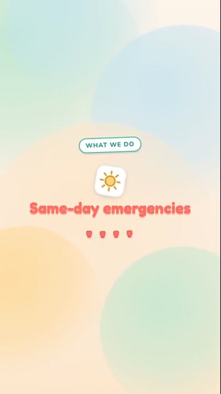
Vertical-first local-business promo. Delivered 9:16, running 20.1 seconds — a vertical build rather than a vertical export. It is the shape a local business actually needs: four service chapters one to a screen, a card answering the three questions somebody rings up to ask, and a booking line to finish on. A vertical data drop built the same way applies the same tall-first build to a single sourced figure.
If the small print has to stay attached, build it into the frame
Plenty of businesses cannot advertise without a line of required text next to the claim — lenders, clinics, brokers, anybody regulated. The usual answer is an end card, and an end card is the least durable place in a film to put anything. It is the part a platform trims, the part a viewer swipes past, the part that disappears the moment somebody lifts a still or lets an algorithm choose its own thumbnail.
On the client film at the top of this page the disclosure is part of the composition instead — and this page would rather give you the real numbers than a round one. For the first twenty-three seconds the registration number and the Equal Housing Lender mark sit locked to the bottom edge, so pausing in that stretch, lifting a still or letting a platform choose its own thumbnail all still show them. The sign-off card then widens the wording, naming the licence and adding that the film is not a commitment to lend. Because the layer is part of the composition, any line of it is corrected with a re-render rather than a reshoot — there is no footage to shoot again. The craft note on that film goes through the structure frame by frame.
Be exact about the division of labour, because a studio should not be casual here. What the line has to say is the advertiser's decision, taken with their own compliance advice; nothing on this page certifies any wording against any rule, and this studio does not give that advice. What the studio is answerable for is narrower and real: that the layer exists, that it is legible at the size the film is actually watched rather than at the size it was designed, and that it survives every cut the film ships in. The same discipline runs through the data-driven films, where a figure has to arrive with its source attached.
The last frame is the one that gets screenshotted, and ours is wrong
A promo's closing card is the frame that travels. It is what gets re-cropped, saved, pasted into a group chat and posted on its own with no context and no runtime around it. Nearly every concept film in this library prints its concept or spec-work line onto that card. The vertical promo above opens with a chip naming it a demo reel, and its practice name, social handle and contact details are invented for the concept. The contact details are safe by construction: the web address sits on a namespace reserved for documentation, and the telephone number cannot be dialled.
The same film handles a smaller version of the same risk correctly, and the distance between those two decisions is the whole lesson. Its service-area map is a dashed ring around a pin rather than a real catchment, and a chip low in the frame marks the area illustrative — but measured against the delivered file, the ring starts drawing about four tenths of a second before that chip arrives. For those four tenths a viewer is looking at what reads like a boundary with nothing qualifying it. The chip should lead the ring, not follow it. Neither of those is expensive to fix; both are the sort of thing that only gets noticed once a demo reel has already been mistaken for a real advertisement.
What a promo cannot do, and what to buy instead
A promo cannot teach. It has half a minute of somebody's attention that they did not choose to give, so it can hold one idea and one way of responding to it, and every second spent on mechanics is a second not spent on that. If the thing being sold has to be understood before anybody will buy it, the format is an explainer, numbered and built around a script, and it is longer on purpose. If the goal is that a company feels a particular way rather than that anybody clicks this week, that is a brand film, bought on register rather than on response. Sending a promo to do either job is the most common way this budget gets wasted, and it is usually decided before anyone opens an editor.
There is also a limit worth stating before you spend a call on it: this studio does not shoot. Everything in these films is drawn and rendered, so if the promo needs your real premises, your product in someone's hands or your team on camera, the honest answer is that somebody with a camera should film that — and a piece of this can still be built to sit around the footage once it exists.
A promo also cannot rescue a claim that is not true. Of the four formats here it is the least forgiving, which means it is the one with the least room for the qualifier that makes a number defensible — and a compressed film with an indefensible figure in it is worse than no film, because it travels further. If the honest version of the claim needs a sentence of context, the promo is the wrong container for it and the right answer is to say the smaller, true thing.
How a promo project runs
It starts with two answers rather than a brief: where this is going to be posted, and what you want somebody to do at the end of it. Those two decide the shape, the runtime, whether the message has to survive being muted, and whether there is small print that has to ride along in every frame. Everything visual is downstream of them, which is why they are worth arguing about before anything is drawn — arguing about placement later, over finished frames, is what turns a promo into a crop. Send what you are promoting and where it needs to run — it lands with the person who will build it.
The project files come with it, and on this format that is worth more than the usual reassurance about ownership. A promo is the piece most likely to be asked for again in a different shape — a new platform, a seasonal variant, a line that has to change — and the studio that holds the only openable copy of it holds the pricing on all of that. The same person writes, draws and renders every piece here, so a question reaches the person who will answer it. The field notes set out how the builds are put together, and the studio’s own identity system is the worked example: one token source driving a mark, a film and a document at once, which is the same machinery that keeps a disclosure layer in the same place in every cut.
What to ask before you commission a promo
Was one of these promos actually made for a real client?
Yes — one of the two. The wide film at the top of this page was built and delivered for a real mortgage lender, Pulse Mortgage, and it carries their real brand name rather than a concept label. The second promo here is self-initiated studio work: a dental practice that does not exist, invented so the vertical local-business register could be built end to end, and labelled “(Concept)” wherever it appears. This studio is founder-direct, the portfolio says which pieces were made for a real business and which were not, and a promo page is a bad place to start being vague about it.
Does it matter where the promo is going to be posted?
It decides the build, so it is the first thing worth agreeing. A promo is not judged in the edit, it is judged in the place it lands — a muted autoplay in a feed, a hero block above the fold, a screen at the back of a room, a link pasted into an email. Those are different films. The one on this page that runs in a feed is built as a vertical frame with the type set at the width of a thumb and a progress row so somebody arriving mid-scroll can see how much is left; the one built for a site and a sales conversation is wide, and it can spend its opening seconds on a mark rather than on a hook. Deciding placement after the film is finished is what produces the cropped, unreadable re-post everybody has seen.
Do you crop the wide cut for the feed, or build the vertical separately?
Built separately, and the two promos here are one of each rather than one film and a squeeze of it. A crop is a composition decision taken after the fact by whoever is not in the room: the frame keeps the middle and throws away whatever was at the edges, which is usually the legend, the qualifier or the call to action. The check that matters is plate by plate: a crop can hide inside an otherwise real build, so every cut is reviewed frame by frame before delivery, starting with the plates a buyer is most likely to re-post.
Our marketing has to carry a disclosure. Can it live inside the video?
It can, and on the client film here it is part of the composition rather than a card at the end. The registration line and the lender mark hold the foot of the frame from the first frame to the twenty-three-second mark, and the closing card then carries a fuller form beneath the call to action. Because the layer is built into the composition, correcting any line of it is a re-render rather than a reshoot. Be clear about the division of labour too, because this is the part a studio should not be casual about: what the line has to say is the advertiser’s decision taken with their own compliance advice, and nothing here certifies any wording against any rule. What the studio answers for is that the layer exists, that it is legible at the size the film is actually watched, and that it survives every cut the film ships in.
What is a promo the wrong tool for?
Teaching, and anything that needs a paragraph of context to be true. A promo has half a minute of attention nobody chose to give it, so it carries one idea and one way to respond — mechanics and caveats both compete with that. Two other formats exist for those jobs: an explainer where the product has to be understood first, a brand film where the goal is how a company feels rather than what anyone clicks this week. Choosing wrongly between the three is decided long before anybody opens an editor, and it is the expensive mistake.
How long should a promo be, and does it need sound?
Both promos here run under half a minute, which is about the honest ceiling for something a stranger did not choose to watch. On sound: neither of these two films is narrated. Each carries a music bed and the type does the talking, which is deliberate rather than a shortcut — feed playback starts muted, so a promo whose message lives only in a voice track is a promo that does not land for most of the people who see it. Elsewhere in this portfolio there is work that does carry a spoken track, and on those pieces the voice is a text-to-speech render rather than a performance anyone gave; each of those pieces prints the script verbatim on its own page, so you can read exactly what was said. A recorded voice can be dropped into a promo too, and it changes the mix rather than the build — but on this format the type still has to carry the message on its own, because most of the audience will never hear either.
Is any of the footage AI-generated?
No frame of either promo is generated. There is no stock library in them and no model draws anything: every frame is a component rendered from code — type, rules, drawn vector shapes, a hand-built map, plus the client’s own logo file and apply code where those belong — so nothing in the frame is a lucky take, and correcting one line means re-running the build rather than booking anything. That is the claim this studio actually stakes itself on, and it is deliberately about the picture. Where the work does use a machine-made element it is said on the page that shows it rather than left for someone to discover, because an anti-claim broader than the truth is the same kind of dishonesty as an inflated one and it is harder to spot, since it reads as extra integrity.
See your own promo, in the shape it has to run in
Tell us what you are promoting and where it needs to land. When there is room, a watermarked sample gets built in that shape — the feed version if that is where it lives, rather than a wide film you would have to crop yourself. Nothing gets signed, and nobody has to book a call to see the result.
Written by Baljeet Aulakh, who builds every piece in this portfolio. Last updated . No AI-generated frames.