B2B-SaaS operations-room data UI
Cadence (Concept)
24 sec · 16:9 · 1:1measured from the file above
The concept behind this SaaS brand film
B2B SaaS brand film and product explainer — Cadence is built around a living operations-room interface. It is drawn as product UI rather than as decoration — dashboards that update, data moving the way it would in the actual tool. It is the film for the company that sells to operators — where the buyer needs to see the product feel fast, legible and in control, not abstracted into vague gradients.
It shows we understand the genre, the legibility demands and the difference between a UI that looks designed and one that looks like it works. A self-initiated concept piece, shown as studio spec work.
A B2B SaaS brand film that badges its mock live and its figure illustrative
It opens on the buyer’s problem rather than on the product. A mono line types itself out — that their revenue lives in a dozen tabs — while the names of the systems holding that revenue sit scattered and unlit around it, and a line beneath states what that costs: every tool, no shared truth. Nothing has been sold yet. Only after that does the product appear, and a later chapter states its claim as a shape rather than a sentence, with the connectors converging into one lit node captioned as a single surface.
The main plate is a ridgeline: weekly profiles stacked front to back, the most recent picked out in the single accent and every earlier week left as white line. Two decisions make it a chart rather than an ornament. A legend sits directly beneath the title saying what the ridge height encodes. And the horizontal axis is labelled in weeks-before-now rather than in dates, so recency reads as a shape without the viewer doing arithmetic to feel it.
The film is dressed as a live product — a status dot reading LIVE, and a query-latency readout in the footer that drifts frame to frame rather than sitting still — and beneath the change it shows on that ridgeline it prints the word ILLUSTRATIVE. It carries that instinct through to the figure that matters most: under the headline number, set beneath a heading calling it the one number that matters, the film prints an illustrative-figure label with its concept line, naming the provenance as well as the status, in both delivered cuts. The square cut is a real square build rather than a crop of the wide one: its chrome re-lays and it prints its own 1080×1080. The product explainer in the same genre takes the opposite approach to the same problem and labels the one figure it shows.
More brand film work from the studio
Blue Snow Developers makes the saas & tech work here the way it makes everything — by hand, from real material, in one engine. Browse every saas & tech piece in the portfolio, see how the studio makes brand films, or what the studio makes and how a project runs, or read the studio’s own identity system — the design tokens, type scale and motion rules behind Cadence (Concept) and everything else here. When the brief is clear, talk to us about a brand film.
Cadence (Concept) is filed under saas & tech. Read next: what a product engineer actually does, the rest of the studio's field notes, and the engineer who builds sites and films.
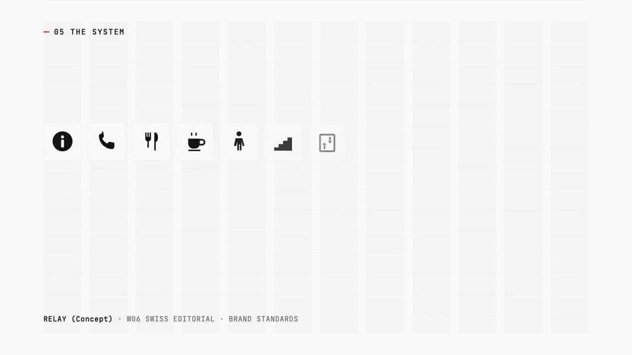
RELAY (Concept)
Brand book, logo and film from one token source
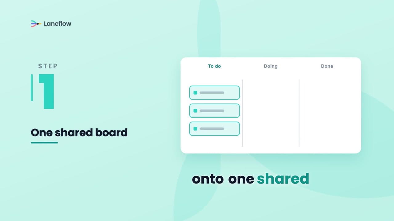
Laneflow (Concept)
Product explainer — software made to click in under a minute
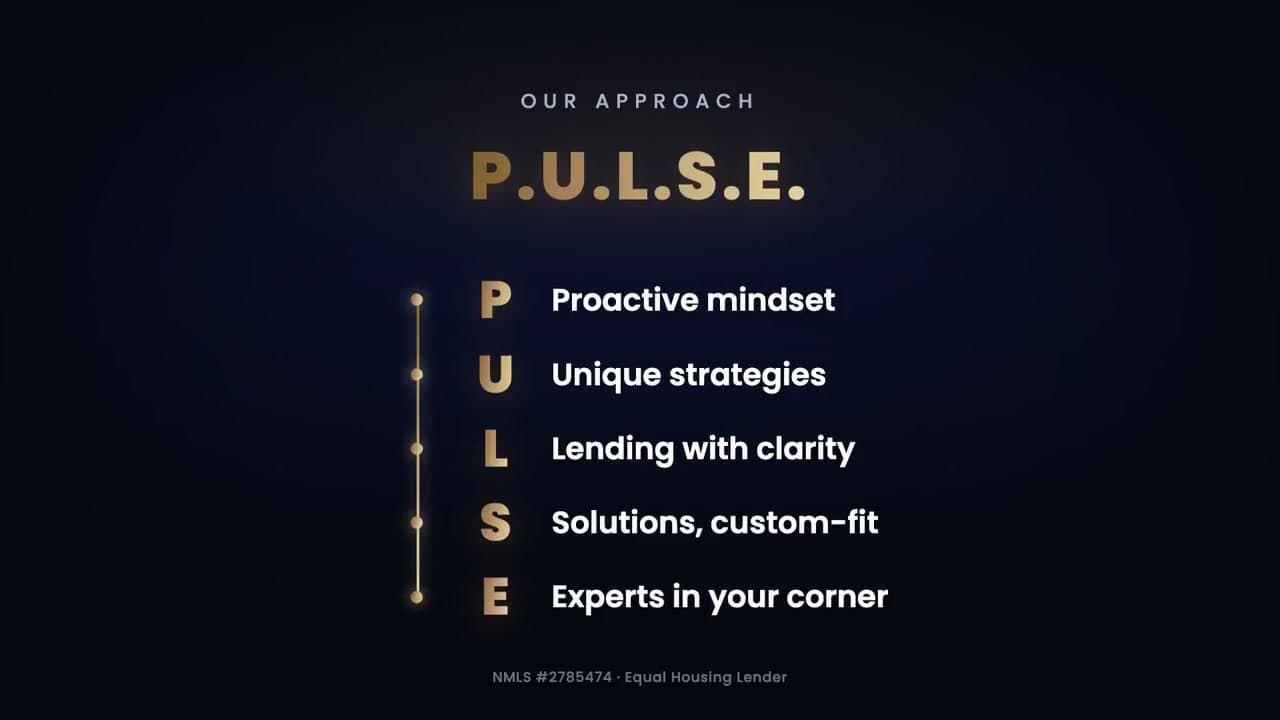
Pulse Mortgage
Brand promo for a real mortgage client
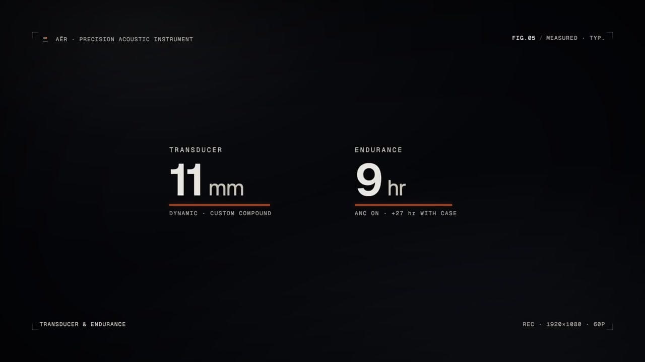
AËR (Concept)
Precision-instrument product reveal + the full brand system from one brief
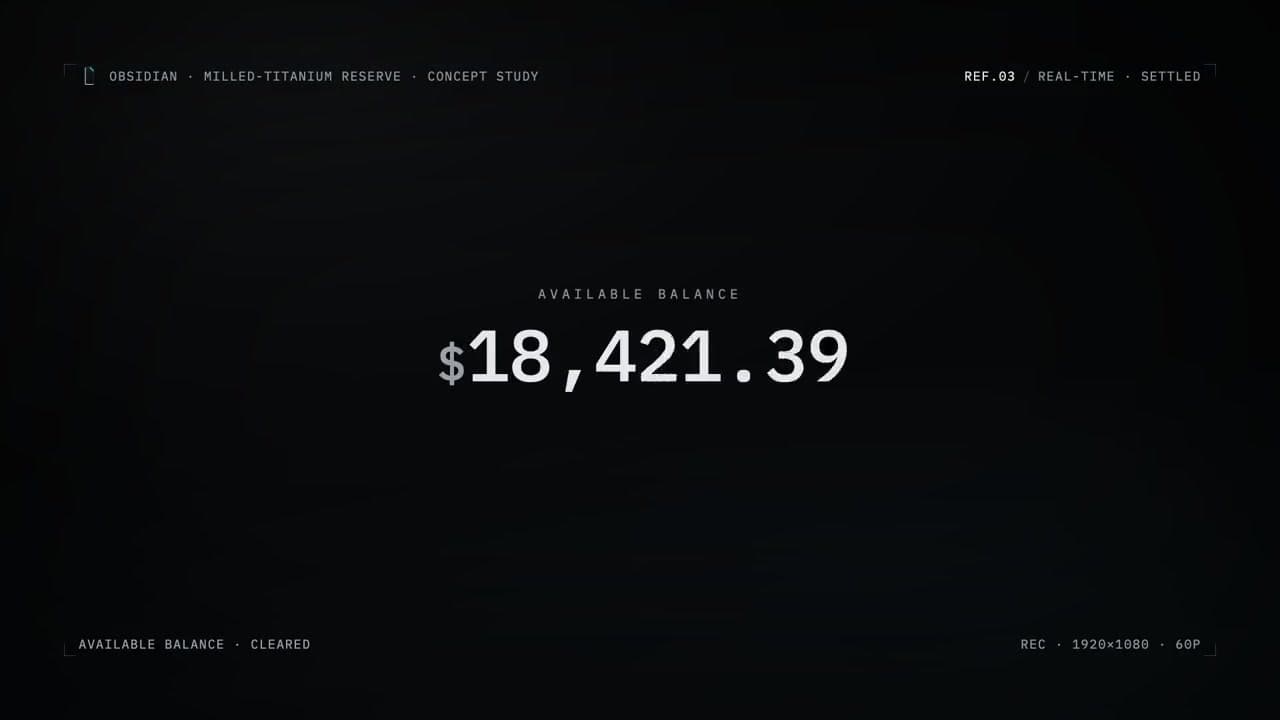
OBSIDIAN (Concept)
Milled-titanium private-vault fintech reveal
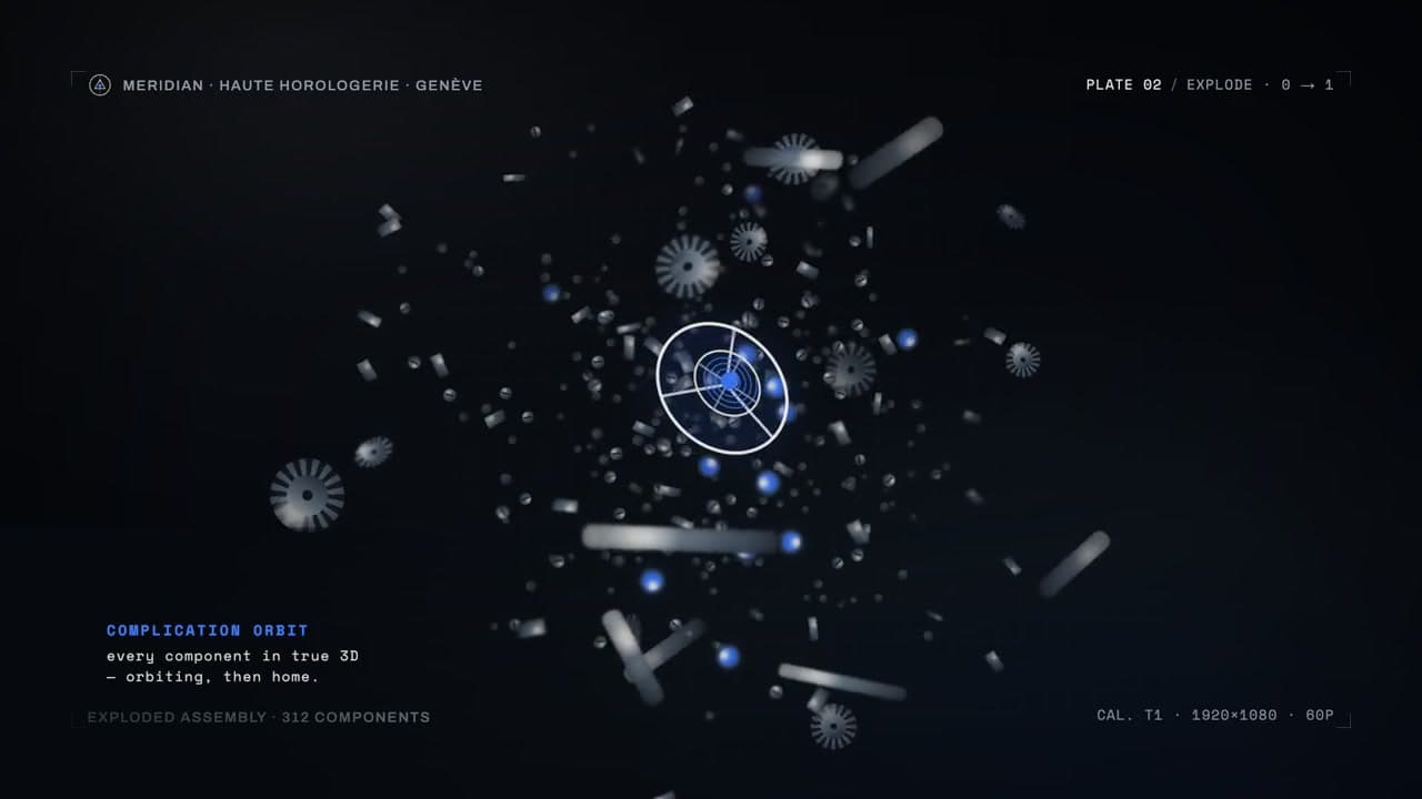
MERIDIAN T1 (Concept)
True-3D exploded-assembly turntable