Look-library range — one frame rendered through 24 of 516 catalogued looks
Lookbook (Concept)
34 sec · 16:9 · captionedmeasured from the file above
The concept behind this DTC ad creative
Ad creative range for DTC brands — Lookbook runs a single frame through two dozen finished looks drawn from a library of 516. Each is a complete art-direction choice — grades, textures and treatments — rather than a slider. It answers the most expensive question in any creative kickoff: "what could this feel like?" Instead of three mood boards and a week, you watch the same product wear film-grain warmth, clean editorial, neon, monochrome and more, back to back, so the conversation starts from finished frames.
For a DTC brand testing ad angles, it is a way to see the range before committing the budget. We show 24 here; the rest are catalogued, not all one-click — an honest distinction we keep everywhere. A self-initiated concept piece, shown as studio spec work.
A look-library range film that prints the recipe under every grade
The claim a range reel has to survive is that what changed is the treatment and not the shot. So this film never changes the shot. One photographic still carries every card — a face at night against street bokeh, moved slowly rather than cut — and an index in the top-left corner counts the cards off against the total, so you always know where you are in the set. Midway through, it does the thing that makes the rest of it worth watching: it drops back to the plate with nothing applied, captioned same pixels, the source plate, ungraded. Without that interstitial a look reel is a run of attractive frames and nobody can tell a grade from a different photograph. With it, the base is on screen, and every card after it is being measured against something you have actually been shown.
Each card then publishes its own recipe. Under the picture a chain line names the treatments in the order they are applied with a strength value on each — a flare at a quarter, grain at a tenth, a warm grade, a little bloom — and beneath it a best-for line naming the categories the look was built for: wedding, travel and fashion on one card; e-commerce, retail and flash-sale on another. That is what turns a mood reel into something you can order from. Somebody who says “the third one, but push the grain” is describing an edit that can be executed exactly, because the parameter is on screen rather than in a colourist’s head, and the card is already the brief. It is the same instinct as the identity system film that prints its own token values: publish the number and the work becomes checkable instead of merely impressive.
The plate is credited in the corner of every card, naming the stock library it came from and an identifier, and that matters more here than on any other piece on this site — it is the only one of ours that shows a photograph of a real, recognisable person. It is also where the discipline runs out, and this page is the place to say so: the identifier is a three-letter code, and nothing in our own records resolves it to a photographer or a licence. For the one film with a face in it, that record should be fuller than it is. The other half of provenance is the naming, and it is not a small share of the cards. Around a third of the looks shown are titled after a specific film, studio, franchise or typeface rather than described by what they do — and those are company and property names, not genre shorthand the way teal-and-orange is. Naming a grade for a film you admire is completely ordinary in a colour suite and everyone in the trade reads it instantly; on a public catalogue that a stranger reads as a product list, it is a different thing, and a look named for what it does is the one that can actually be handed over on a brief. The closing plate holds the size of the library, the size of the treatment set, and the argument under both: describe the look, and it gets built the same way every time.
Read the narration in full — 3 passages, verbatim
Taken from the caption track this player loads — not a summary of it, so anything the film claims can be checked against the frame that carries it.
One frame. Every look we make. Same pixels.
Five hundred and sixteen ways to grade them. Describe the look. We build it.
Every time, the same.
More ad creative work from the studio
Blue Snow Developers makes the dtc & e-commerce work here the way it makes everything — by hand, from real material, in one engine. Browse every dtc & e-commerce piece in the portfolio, see how the studio makes ad creative, or what the studio makes and how a project runs, or read the studio's own identity system — the design tokens, type scale and motion rules behind Lookbook (Concept) and everything else here. When the brief is clear, talk to us about ad creative.
Lookbook (Concept) is filed under dtc & e-commerce. Read next: what a product engineer actually does, the rest of the studio's field notes, and a film studio run by an engineer.
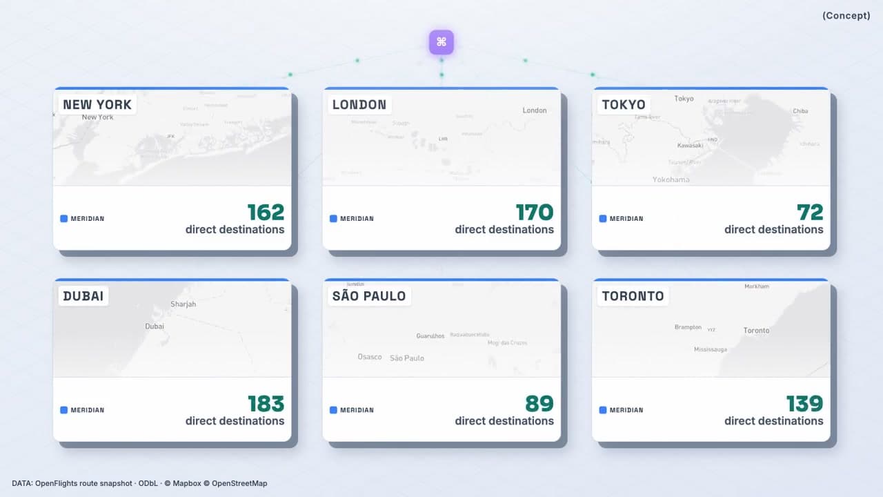
Index Card (Concept)
Deterministic N-variant batch render — one composition, every city
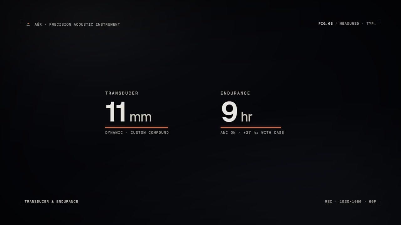
AËR (Concept)
Precision-instrument product reveal + the full brand system from one brief

SÈVE (Concept)
Generative logo reveal — stroke-draw → seeded filigree → particle-coalesce
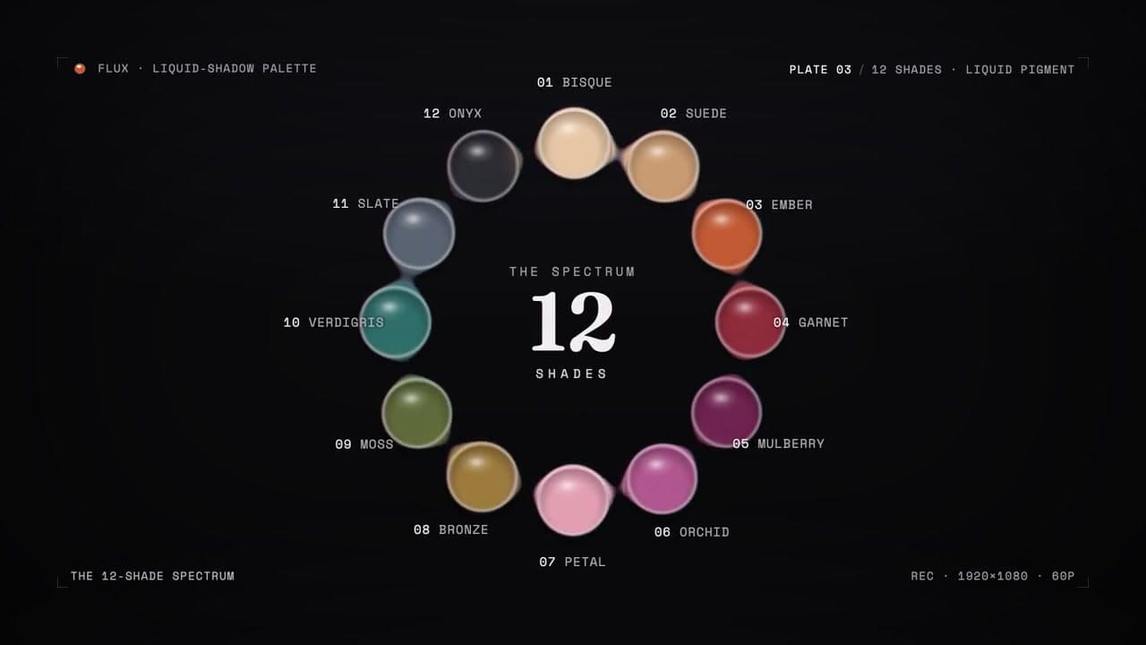
FLUX (Concept)
SDF metaball liquid-morph cosmetics
Northwoods Roastery (Concept)
Full coffee-brand film — warmth and tactility, engineered underneath
Pulse Mortgage
Brand promo for a real mortgage client